Squarespace Fluid Engine: The Complete Guide for 2026
Fluid Engine is the drag-and-drop CSS Grid editor that Squarespace 7.1 uses for block sections. It gives you a 24-column grid on desktop and a separate 8-column grid on mobile, lets blocks overlap, and writes its layout into the page itself rather than into your stylesheet. That last detail is the one that catches people out: Fluid Engine's positioning beats custom CSS by default, and upgrading a section to it cannot be undone once you save.
This guide covers the whole system — the grid, availability, the mobile split, the CSS behaviour, the conversion path, and the things Fluid Engine still cannot do.
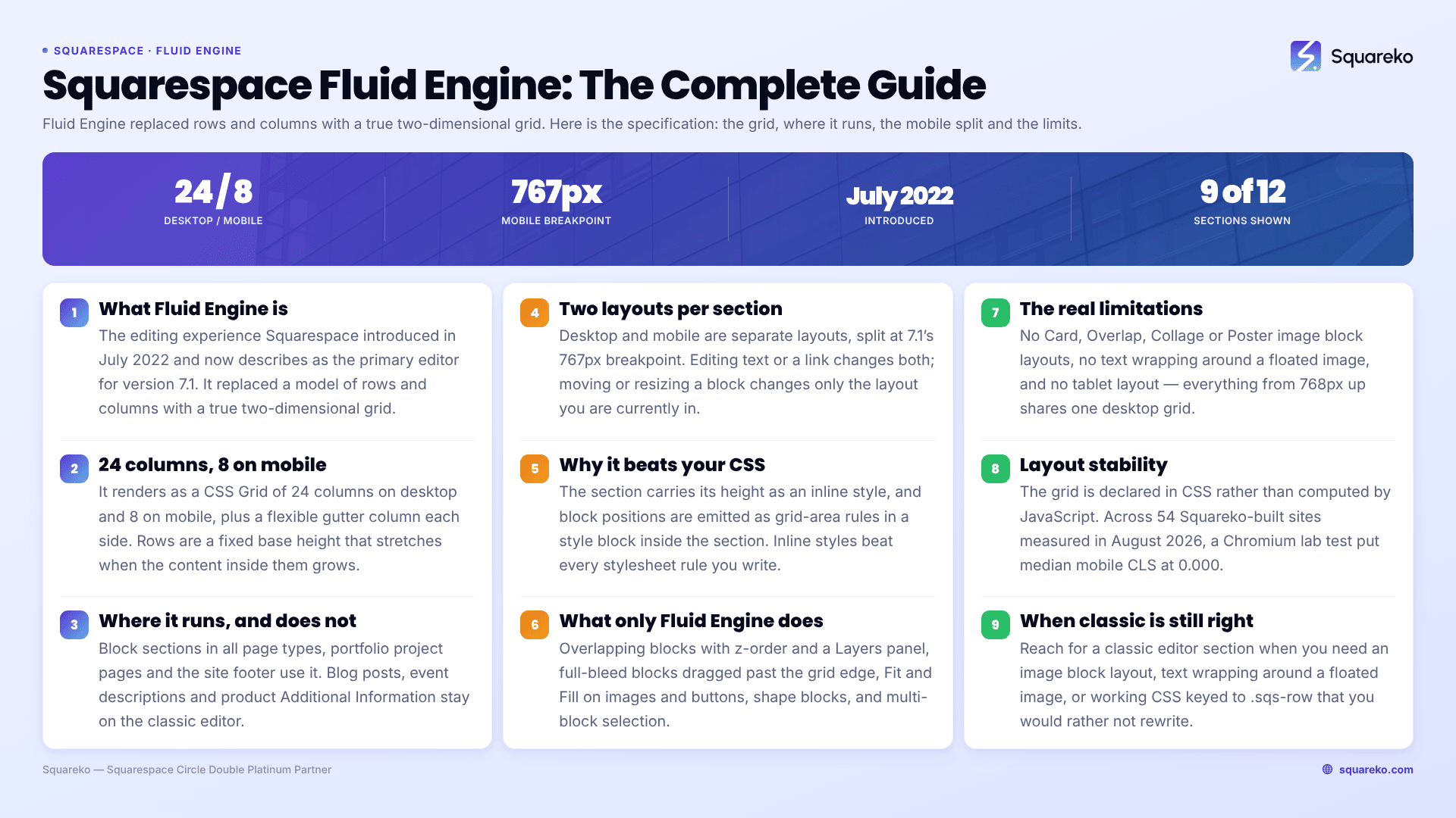
Fluid Engine at a glance
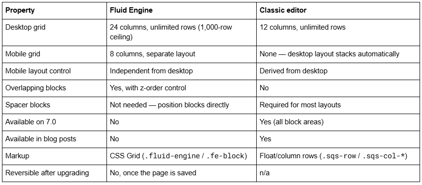
Version note: everything below applies to Squarespace 7.1 in 2026. Squarespace 7.0 sites have no access to Fluid Engine at all — see is Fluid Engine available on 7.0 for the full answer to that one.
What Squarespace Fluid Engine actually is
Fluid Engine is the editing experience that Squarespace introduced in July 2022 and now describes as the primary editor for version 7.1. It replaced a layout model built on rows and columns with one built on a true two-dimensional grid.
The practical difference is what happens when you drag a block. In the classic editor, moving a block reflows everything around it, because blocks live inside rows and columns that must stay full. In Fluid Engine, each block occupies a rectangle of grid cells and stores its own start and end coordinates, so moving one block leaves the others where they are.
You can tell which editor a section uses in about two seconds. Click Edit on the page and look at the top-left corner of the section:
An Add Block button in the corner, and a grid that appears when you drag — Fluid Engine.
No button, just + icons on the page — classic editor.
Press G while editing a Fluid Engine section to pin the grid on permanently. Press G again to hide it. That single shortcut is the difference between guessing at alignment and seeing it.
The Fluid Engine grid: 24 columns on desktop, 8 on mobile
This is the specification that almost no ranking page states plainly.
Squarespace Fluid Engine renders as a CSS Grid with 24 columns on desktop and 8 columns on mobile, plus a flexible gutter column on each side. Rows are a fixed base height that stretches when the content inside them grows — Squarespace's own engineering write-up describes it as grid-template-rows: repeat(var(--num-rows), minmax(var(--row-height), auto)).
Look at the real output on any live 7.1 Fluid Engine section and you will find something close to this inside the section:
.fe-678617c7cf28ed1a1e1e1524 {
  --cell-max-width: calc((var(--sqs-site-max-width, 1500px) - (11.0px * (8 - 1))) / 8);
  display: grid;
  grid-template-rows: repeat(36, minmax(24px, auto));
  grid-template-columns:
    minmax(var(--grid-gutter), 1fr)
    repeat(8, minmax(0, var(--cell-max-width)))
    minmax(var(--grid-gutter), 1fr);
}
@media (min-width: 768px) {
  .fe-678617c7cf28ed1a1e1e1524 {
    --cell-max-width: calc((var(--sqs-site-max-width, 1500px) - (11.0px * (24 - 1))) / 24);
    --row-height-scaling-factor: 0.0215;
    grid-template-rows: repeat(15, minmax(calc(var(--container-width) * var(--row-height-scaling-factor)), auto));
    grid-template-columns:
      minmax(var(--grid-gutter), 1fr)
      repeat(24, minmax(0, var(--cell-max-width)))
      minmax(var(--grid-gutter), 1fr);
  }
}
Three things follow from that, and all three matter in daily use.
Column widths are proportional, not fixed. A block spanning 12 of the 24 desktop columns is half the content width at every screen size above the breakpoint. It does not become narrower in pixels and then reflow; it stays at 50% and simply shrinks. That is why a block sized to 4 columns on a 27-inch monitor becomes unreadably narrow on a 13-inch laptop.
Row height on desktop scales with the container, not the viewport. The --row-height-scaling-factor is applied to the section's content width, so a taller browser does not give you taller rows. On mobile the base row height is a flat 24px minimum.
Rows stretch, columns do not. Because the row template uses minmax(..., auto), a text block that wraps onto an extra line pushes its own row taller and moves everything below it down. Columns have no equivalent behaviour — text that is too wide for its block simply wraps or overflows.
You control the grid height directly. In Edit Section → Design, use Row Count to set the number of rows, or drag the blue arrow in the bottom-right corner of the section on the page. Row Count is the only section style that can differ between the desktop and mobile layouts.
Where Fluid Engine is available in Squarespace 7.1 — and where it is not
Squarespace's phrasing is that block sections in all page types, portfolio projects and the site footer can use Fluid Engine. What that leaves out is the list of places that still run the classic editor, and that list is the source of most confusion.
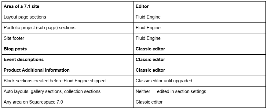
Blog posts do not use Fluid Engine. This is the single most common wrong assumption in the Squarespace forums, and it has real consequences: the drag-and-drop grid, block overlap, separate mobile layouts and shape blocks are all unavailable inside a blog post. A post body is a classic editor content area with a 12-column invisible grid, spacer blocks and automatic mobile stacking. If you are designing a rich post layout, you are designing it in the classic editor whether you meant to or not.
The same applies to event descriptions and the Additional Information tab on products. Squarespace has said it expects to extend Fluid Engine to more areas over time, but as of 2026 those three remain classic.
Auto layouts and gallery sections are a separate category again — they are not block sections at all, so neither editor applies. You add content to them through section settings and Squarespace arranges it.
How the Fluid Engine mobile layout diverges from desktop
Fluid Engine keeps two separate layouts per section: one for desktop and one for mobile. They share content but not position. This is the biggest behavioural change from the classic editor, and the one that produces the most "my site looks broken on my phone" support tickets.
Squarespace 7.1's mobile breakpoint is 767px. Below that width, the 8-column mobile grid and the mobile block positions take over; at 768px and above, the 24-column desktop grid applies. In the generated CSS this is a straight @media (min-width: 768px) split, which is why a media query written at 640px or 800px in your own stylesheet fires at the wrong moment.
What carries across the two layouts and what does not:
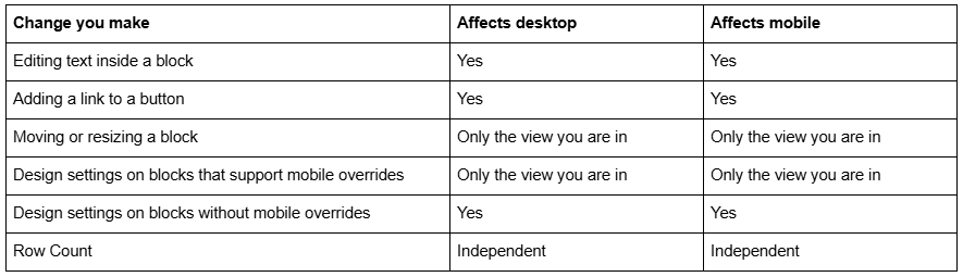
Click the Mobile View icon in the top-right corner while editing to switch. In mobile view, selecting a block gives you ↑ and ↓ buttons that move it above or below the adjacent block — far faster than dragging when you only need to reorder a stack.
Two behaviours are worth knowing before you spend an afternoon fighting them:
New blocks land in the mobile layout automatically, and not always sensibly. When you add a block to the desktop layout after you have already tidied the mobile one, Squarespace places it in the mobile layout as close to the desktop position as it can. On a section with overlapping blocks that guess is frequently wrong. Check mobile every time you add a block, not at the end of the build.
You can hide blocks per browser size. Open the Layers panel in the top-left corner of a Fluid Engine section and click the eye icon next to a block. That block is hidden at the browser size you are currently editing at. It is the supported way to serve a shorter headline to phones without duplicating the section. You cannot hide a block at browser sizes larger than your own monitor can display, and there is no toggle to hide a block at every size at once.
The detail on breakpoint behaviour, tablet widths and mobile overrides is in Fluid Engine mobile editing.
Why Fluid Engine beats your custom CSS
Fluid Engine does not put your layout in a stylesheet. It writes it into the page.
Two mechanisms are at work, and confusing them wastes hours.
1. Inline style attributes. The section wrapper carries its height as a literal inline style — <section class="page-section layout-engine-section ..." style="min-height: 45vh;"> — and the content wrapper carries its vertical padding the same way. Inline styles beat every stylesheet rule regardless of specificity. The only thing that overrides them is !important.
2. A per-section <style> block inside the body. Block positions are emitted as real CSS rules, but inside the section markup rather than in your stylesheet:
.fe-block-yui_3_17_2_1_1736862061587_601121 {
  grid-area: 1/2/3/10;
  z-index: 1;
}
@media (min-width: 768px) {
  .fe-block-yui_3_17_2_1_1736862061587_601121 {
    grid-area: 1/2/3/13;
    z-index: 1;
  }
}
Your Custom CSS panel is served as a linked stylesheet in the <head>. Fluid Engine's block rules live in the <body>. When two rules have equal specificity, the later one wins — so Fluid Engine wins on document order every time, even though your selector looks identical to its selector.
The working pattern is therefore the same in both cases:
/* Override a Fluid Engine block position on mobile only. Match the breakpoint exactly: 767px, not 768px or 640px. */
@media screen and (max-width: 767px) {
  .fe-block-yui_3_17_2_1_1736862061587_601121 {
    grid-area: 4 / 2 / 8 / 10 !important;
  }
}
A few rules of thumb that hold up:
Target .fe-block-<id> for a single block, .fluid-engine for the grid container, and section.layout-engine-section when you want every Fluid Engine section on the site.
Block IDs are regenerated when a block is deleted and rebuilt. Comment every block-ID rule with what it points at.
If you find yourself adding !important to every rule, the honest answer is usually that the layout should be fixed in the editor rather than in CSS. Fluid Engine gives you separate mobile positioning precisely so you do not have to write this code.
If your CSS has stopped applying more generally, the wider diagnostic list is in Squarespace custom CSS not working.
Switching a classic editor section to Fluid Engine
Any classic editor section can be converted. Click Edit on the page, then click Upgrade in the top-left corner of the classic section.
Two things about that button deserve more prominence than Squarespace gives them.
It is one-way once you save. Squarespace's own note is explicit: it is not possible to revert an upgraded section after saving the page. Before you save, Undo still works. After you save, the classic version of that section is gone.
A tall section may be split in two. Conversion respects a 1,000-row grid limit. If the classic section's height exceeds it, Squarespace splits the result into multiple Fluid Engine sections.
The safe sequence, and the one worth making a habit:
Duplicate the page (or the section) first, so an untouched copy exists.
Upgrade one section.
Check the desktop layout, then switch to mobile view and check that.
Save only when both are right.
Expect the layout to shift slightly. Classic editor spacing came from spacer blocks and column proportions; Fluid Engine has to translate that into grid coordinates, and the translation is approximate. Custom CSS written against classic markup — anything keyed to .sqs-row, .sqs-col-6, .span-6 or the section's data-section-id — will not survive, because Fluid Engine replaces the row-and-column structure with CSS Grid and the section is rebuilt.
The full pre-flight list is in how to switch a section to Fluid Engine, and the honest answer about reversing it is in can you switch back to the classic editor.
What Fluid Engine can do that the classic editor cannot
The capability gap is real and it is mostly in Fluid Engine's favour.
Overlapping blocks with z-order. Place a text block on top of an image block, then use Move Forward and Move Backward in the block toolbar, or drag blocks up and down in the Layers panel. The classic editor cannot overlap blocks at all.
Full-bleed blocks. Drag a block past the edge of the grid and it resizes to the edge of the section. No custom CSS required.
Fit and fill on images and buttons. In a block's Design tab, Fill stretches content to the edges of the block; Fit keeps padding around it and exposes alignment controls. Image blocks default to Fit, button blocks default to Fill.
Separate mobile design. Covered above — the classic editor has none.
Shape blocks. Solid colour shapes without uploading an image. Fluid Engine only.
Multi-block operations. Drag across the section background to highlight several blocks, or press Cmd/Ctrl + A to select all of them, then move, align or resize the whole set at once. Align Group in the toolbar aligns the selection.
The layout switcher. Hover a section and click View Layouts to see alternative arrangements of the same blocks. Click one to apply it, or undo to go back.
The step-by-step version of all of this, including the moves most people never find, is in how to use Fluid Engine.
The real limitations of Fluid Engine
Fluid Engine is not a strict upgrade. Four things genuinely got worse or went missing, and one is a design constraint that no amount of technique fixes.
Image block layouts are gone. The classic editor's Inline, Poster, Card, Overlap and Collage layouts — image plus caption plus text in a preset arrangement — do not exist in Fluid Engine. Squarespace's guidance is to rebuild them by overlapping an image block with text and button blocks. That works, but it is three or four blocks per layout instead of one, and each of them needs positioning twice.
Text does not wrap around images. Floating an image inside a text block, the classic editor's pull-quote pattern, has no Fluid Engine equivalent.
There is no tablet layout. Fluid Engine has exactly two layouts: desktop and mobile, split at 767px. Everything from 768px up to a 27-inch monitor uses the same desktop grid, proportionally scaled. A block sized to 4 of 24 columns looks deliberate at 1600px and cramped at 800px, and there is no separate view in which to fix it. The practical workarounds are to size blocks generously, keep related text in a single block rather than several, and set buttons to Fit so their text does not wrap when the grid compresses.
Blocks cannot be moved between content areas. You can copy and paste blocks between Fluid Engine sections on the same site, but you cannot drag a block from a footer into a blog post, or between separate content areas generally. The classic editor has the same restriction.
Editing at the wrong window size distorts everything. Squarespace's stated minimum for editing is a browser window of at least 1280 × 768. Below that, block handles crowd together and the grid preview compresses. Editing in a very large window has the opposite failure — content that looks correctly spaced at 2560px shows gaps at 1440px. Build at a normal laptop width and check the extremes afterwards.
Fluid Engine and page performance
Fluid Engine's layout is declared in CSS, not computed by JavaScript after load. The grid template, the block coordinates and the breakpoint switch are all in the markup the server sends, which means the browser can lay the page out on first paint rather than after a script runs.
That shows up in layout stability. Across 54 Squareko-built client sites measured in August 2026 — a Playwright/Chromium lab test from a cloud datacenter, unthrottled, single run per site, load-only CLS — median mobile CLS was 0.000, with 31 of the 54 recording exactly zero layout shift. Desktop is weaker: median 0.029, with 80% inside Google's "good" threshold. Lab numbers are not field numbers, and CLS is not the whole picture, but the direction is consistent with a grid that is declared rather than calculated.
What Fluid Engine does not protect you from is weight. It makes it easy to stack a dozen blocks and three background images into one section. Across the same 54 sites, median page weight was 3.0 MB across 93 requests. Section count is the lever most people ignore — Squarespace itself recommends no more than 20 sections on a single page.
When to use a classic editor section instead
Classic editor sections are still available in Squarespace 7.1, and there are cases where reaching for one is the right call rather than a nostalgic one.
Use a classic editor section when:
You need an image block layout — Card, Overlap, Collage, Poster — that Fluid Engine does not have.
You need text to wrap around a floated image.
You have working custom CSS written against .sqs-row / .sqs-col-* markup that you do not want to rewrite.
The section is a simple stack of full-width blocks, and automatic mobile stacking is genuinely what you want. In that case Fluid Engine's separate mobile layout is a second thing to maintain, not a feature.
To add one: Edit the page → Add Section → + Add Blank → Classic Editor. For pre-built classic layouts, scroll to the bottom of the section menu and click Made with Classic Editor.
Mixing the two on one page is fine and common. Visitors cannot tell the difference; the markup differs but the rendering does not.
The side-by-side feature comparison is in Fluid Engine vs classic editor, and the situational recommendation — which one is better for a given kind of site — is in classic editor or Fluid Engine: which is better.
Working with Fluid Engine day to day
The short version: build the desktop layout, check mobile before you save, keep blocks generously sized so the tablet range does not fall apart, and fix positioning in the editor rather than in CSS wherever you can. Fluid Engine's inline styles and in-body rules will win the cascade, and fighting them with !important produces a site that only one person can maintain.
If a section has stopped responding to drags, or blocks jump when you resize them, the specific fixes are in Fluid Engine not working.
Where this gets genuinely difficult is a site that was built in the classic editor, half-converted, and now carries custom CSS written against both markup structures. Untangling that means reading what the page actually outputs rather than guessing, and it is slow work by hand. That's the sort of thing our Squarespace website support plans exist for — most Fluid Engine layout conflicts we're sent are diagnosed inside a single support block. No obligation either way; the grid, the breakpoint and the Layers panel resolve the large majority of cases on their own.
FAQ
-
Fluid Engine is the drag-and-drop editor Squarespace 7.1 uses for block sections. It renders sections as a CSS Grid — 24 columns on desktop, 8 on mobile — and lets you place, resize and overlap blocks freely. It replaced the classic editor's row-and-column model and is now the default for new sections.
-
Twenty-four on desktop and eight on mobile, plus a flexible gutter column on each side. Rows have a minimum height that stretches automatically when content grows. Press G while editing a Fluid Engine section to keep the grid visible so you can see the columns as you position blocks.
-
No. Blog post bodies use the classic editor, as do event descriptions and the Additional Information tab on products. Fluid Engine is available in block sections on layout pages, portfolio project pages and the site footer. Squarespace 7.0 sites have no Fluid Engine at all.
-
Because Fluid Engine keeps separate desktop and mobile layouts for every section, split at Squarespace 7.1's 767px breakpoint. Moving a block on desktop does not move it on mobile. Click the Mobile View icon while editing and arrange the mobile layout independently, then save.
-
Only before you save. Squarespace states it is not possible to revert an upgraded section once the page has been saved. Click Undo while still editing to reverse it. The safe habit is to duplicate the page or section before clicking Upgrade, so an untouched classic version survives.
-
Because Fluid Engine writes layout into the page rather than into your stylesheet — inline style attributes for section height and padding, and a per-section style block in the body for block positions. Both land after your Custom CSS in the cascade, so !important is the reliable override.

Author Bio
I'm Walid Hasan, a Certified Squarespace Expert and Squarespace Circle Platinum Partner with over 12 years of hands-on experience designing and optimizing high-performing websites. Over the years, I've had the privilege of building more than 2,000 Squarespace websites for clients around the world, always focusing on clean design, strong user experience, and conversion-driven results.