
How to hide sections on mobile in Squarespace 7.1
The emergence of mobile devices has made it extremely important to have a mobile-friendly website. It makes it easier for your visitors, improves your rank in search engines, and thus your online presence. This is why we recommend Squarespace for beginners, as it automatically changes to suit the screen size of any device, a big win! But occasionally, your site looks amazing on a computer, but not quite so incredible on a phone or tablet since you designed it that way. But don't worry! With Squarespace comes the feature of adjusting what your site looks like on mobile via a small piece of code. In this blog post, we will explain how to hide elements of your site on mobile. This is useful for certain sections that sparkle on a computer, but don’t translate on a smaller screen. So come on let's get this show on the road!
Sections on Squarespace Mobile Hide: Why?
Mobile hiding sections are not the same as taking away content, but rather a new way of telling your story to your mobile users. Here’s why it’s a useful practice:
Enhanced User Experience for Mobile: Users on mobile tend to behave differently than those on desktops. This de-clutters the mobile experience, so visitors can quickly find what they're looking for. Fewer distractions make navigation easier and reading more straightforward.
Fast Loading Speed for Mobile Pages: Since mobile devices usually have less processing power and a slower connection, One of the ways we can significantly boost the speed of our webpages while they load (a key area of focus both for SEO and user satisfaction) is by minimizing the number of elements that need loading.
Improved Mobile Navigation: An overcrowded mobile menu can be frustrating. Hence, hiding those secondary sections will help you navigate better and focus on the most important CTA and content.
Clear and Straightforward Mobile Layout: A clear, uncluttered mobile layout is more engaging as well as professional. Revise Mobile Layout: You can hide sections to get a better layout on the mobile device.
Mobile Content Hierarchy: Because the screen size is smaller, it is important to content-hierarchize. Show only mobile relevant sections by hiding less important sections.
Step 1: SECTION DATA ID’S
In this tutorial, we're going to talk about something called "data section IDs."
So, what are they exactly? Well, data section IDs are basically unique identifiers attached to different sections of your website. They help us target specific sections when we want to make changes, like hiding them on mobile view.
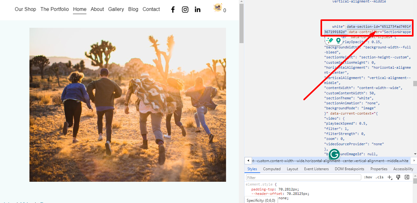
Here's an example of what a data section ID looks like: section[data-section-id="651273fad7491f367199182d"]
Now, you might be thinking, "This sounds a bit complicated," but don't worry! There's a really handy tool called the Squarespace ID Finder Chrome extension that makes it super easy. It shows you all the data section IDs for every section on your website with just a click.
To use it, simply add the extension to your Chrome toolbar, open your website, and click the grid icon in the top right corner to activate it. Then, you'll see all the block codes and IDs for each section of your site.
To find a specific data section ID, just go to the section you want to hide on mobile, and look for the blue sticker that says something like "section{data-section-id...}". That's your data section ID right there! Easy, right? Now you're ready to customize your site for the best mobile experience.
Step 2:How to hide a section on mobile on a Squarespace website
If you've got a section on your website that looks great on big desktop screens but turns into a mess on mobile, don't worry! You can easily hide it on mobile devices using some custom CSS.
Here's what you do:
Go to Design > Custom CSS in your website admin panel.
Copy and paste this code snippet into the Custom CSS text box:
CSS:
/* Hiding sections on mobile */
@media screen and (max-width: 641px) {
 section[data-section-id="YOUR-SECTION-ID"] {
 display: none !important;
 }
}
Instead of "YOUR-SECTION-ID", insert the section ID of the section you want to hide. You can find this using the Chrome extension we installed earlier.
Click Save in the upper left corner.
Check the mobile view in the upper right corner to see if the section disappears on mobile.
That's it! Now your website will look cleaner and more user-friendly on mobile devices.
Conclusion
Hiding sections on mobile in Squarespace 7.1 mobile redirection is a really effective method for making your site mobile-friendly. With proper usage and best practices we can overcome the challenges of CSS in mobile design and enable a minimalistic, easy, and engaging mobile use experience. Keep content first, test frequently, always think about the user experience. When you learn these strategies, your Squarespace website will be mobile responsive and look its best on any screen.
FAQ: Hiding Sections on Mobile in Squarespace 7.1
2. Will this affect desktop users?
No, the CSS code applies only to screens with a width of 640 pixels or less, meaning it only affects mobile users.
3. How do I find the section ID?
You can use the Squarespace ID Finder Chrome extension or inspect the page’s HTML in the browser’s developer tools.
5. Can I hide a section without using CSS?
Squarespace does not have a built-in feature for hiding sections on mobile, so using CSS is the best method.